Have you noticed how color trends feel softer, richer, and more intentional lately? That’s not an accident. The 2026 Color of the Year selections across major paint and design brands are all pointing in the same direction: calm, grounded, and quietly confident spaces that feel lived-in—but elevated.
Whether you’re preparing a home for sale or refreshing the space you already love, these colors offer clear guidance on what today’s buyers and homeowners respond to most.
The Big Picture: A Shift Toward Warmth and Depth
Here’s what the leading brands are telling us:
-
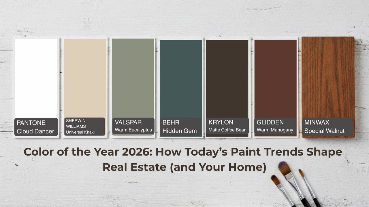
Pantone – Cloud Dancer
A soft, airy neutral that feels light without being stark. It’s ideal for open layouts where you want brightness with warmth—perfect for staging and photography. -
Valspar – Warm Eucalyptus
A muted green that feels natural and restorative. This color works beautifully in kitchens, dining rooms, and primary bedrooms where buyers crave calm. -
Behr – Hidden Gem
A deep, moody blue-green that adds instant character. It’s a strong choice for offices, libraries, or accent rooms that need definition. -
Minwax – Special Walnut
Not just paint—wood tones matter. This warm stain reinforces the trend toward organic finishes and timeless materials. -
Glidden – Warm Mahogany
A rich, reddish-brown that feels classic and grounded. It’s especially effective in entryways, mudrooms, or lower-level spaces. -
Krylon – Matte Coffee Bean
Deep neutrals are showing up everywhere—even in hardware, railings, and furniture—adding contrast without harshness. -
Sherwin-Williams / HGTV Home – Universal Khaki
A versatile green-neutral that bridges modern and traditional styles, making it a smart choice for whole-home palettes.
How These Color Trends Show Up in Real Estate
In real estate, color isn’t about personal taste—it’s about emotional response.
You’re seeing fewer bright whites and more:
-
Warm neutrals that photograph softly
-
Greens and browns that reference nature
-
Saturated hues used intentionally, not everywhere
For sellers, this means:
-
Homes feel more “designed” without feeling risky
-
Buyers can picture themselves in the space
-
Rooms feel purposeful instead of generic
For homeowners, it means you can finally embrace color—without hurting resale value—when it’s done thoughtfully.
How Homeowners Can Apply These Trends Right Now
You don’t need a full renovation to stay current. Start here:
-
Use soft neutrals like Cloud Dancer or Universal Khaki in main living areas
-
Add depth with Warm Eucalyptus or Hidden Gem in bedrooms or offices
-
Incorporate wood tones like Special Walnut through furniture, shelving, or built-ins
-
Ground a space with darker accents—doors, cabinetry, or trim in coffee or mahogany tones
The key is balance: light where you want openness, depth where you want intimacy.
Let’s Talk About Color Drenching (and Why You Might Regret Skipping It)
If you’ve ever painted a room and felt something was missing afterward, you’re not alone. One of the biggest design regrets homeowners mention lately is not color drenching a space.
Color drenching means painting:
-
Walls
-
Trim
-
Doors
-
Sometimes ceilings
…all in the same color (or very close shades).
The result? A room that feels cohesive, intentional, and surprisingly calming.
Color drenching works especially well in:
-
Primary bedrooms
-
Home offices
-
Powder rooms
-
Dining rooms
-
Mudrooms and entryways
Deep hues like Hidden Gem, Warm Mahogany, or Universal Khaki truly shine here. Instead of breaking up the room visually, everything blends—making the space feel richer and more elevated.
If you’ve already painted and wish you’d gone all in, you’re not alone. The good news? Trim and doors can always be updated later to finish the look.
Final Takeaway
The 2026 Color of the Year selections aren’t about playing it safe—they’re about being intentional. In real estate, these colors help homes feel current, warm, and memorable. As a homeowner, they give you permission to embrace depth and personality without sacrificing long-term value.
If you’re thinking about selling, renovating, or simply making your home feel better to live in, these trends offer a smart place to start.
Ready to Apply This to Your Home?
If you’re unsure which colors will elevate your home—or which updates actually matter before selling—I’m happy to help you prioritize strategically.