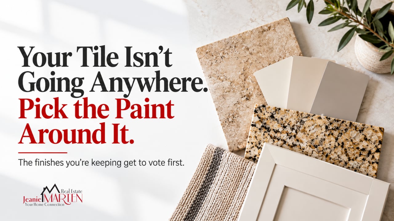
Your Tile Isn't Going Anywhere. Pick the Paint Around It.
How do you choose paint when the tile, granite and cabinets have to stay? Match the undertone of the finishes you are keeping, not their color. Warm tile and gold granite need warm whites and greiges. Cool gray quartz needs cool neutrals. Mixing the two makes both look wrong.
I see the same mistake in house after house and it is almost always made by someone who was trying to modernize.
The tile is warm. Builder-grade 18 inch travertine look, or a tan porcelain with a gold cast, installed somewhere between 1998 and 2008 and running through the entry, the kitchen and every wet room in the house. Then at some point the homeowner updated the counters and what they picked was a cool gray quartz because that is what has been on every showroom floor for a decade. Now the quartz makes the tile look orange, the tile makes the quartz look dirty and then they paint the walls gray to go with the new counters and it gets worse.
This is the fixed-finish problem. Most homeowners in Sachse, Wylie and Murphy are not gutting a house before they sell it. They are choosing paint around tile, granite and cabinets that are not moving. That is solvable but only if you stop shopping for a color and start reading undertones.
The Finishes You Are Keeping Get to Vote First
Write down what is staying. Floor tile. Countertops. Cabinets. Backsplash. The brick on the fireplace, which in a lot of North Texas houses is a big red-orange mass in the middle of the main living space. Shower surrounds. Anything you are not willing to spend money on right now.
That list is your palette. It was set years ago by a builder or a previous owner and it outranks whatever color is trending. Paint is the cheapest thing in the room so paint is the thing that adapts.
Undertone Is Not the Same as Color
Color is what you would call it out loud. Beige. Gray. White. Undertone is the hidden bias underneath it and it is why two beiges can look nothing alike on the wall. A warm undertone pulls yellow, gold, tan, orange or pink. A cool undertone pulls gray, blue, green or violet.
You do not need a beige wall to go with beige tile. You need a wall with the same undertone as the tile. That is why a warm white can look right over gold granite while a "neutral" gray looks like a mistake.
The printer paper test. Hold a sheet of plain white copy paper flat against the finish, in daylight, with the lamps off. Copy paper is close to a true neutral, so whatever the finish does next to it is its undertone showing. Gold or pink means warm. Gray or blue means cool. Do it on every surface on your list. It takes ten minutes and beats your memory of the room.
Two tips. On old tile, read the grout, because grout is a flat solid color and gives a truer answer than variegated tile. On granite, ignore the flecks and read the background field. Santa Cecilia and New Venetian Gold, both everywhere in DFW, read warm despite their black and gray specks. Uba Tuba reads cool green. Absolute black is close to neutral and the easiest counter in the world to paint around.
Warm Finishes Want Warm Paint
If your list came back mostly warm, which it will in most houses built here before about 2010, stay in the warm neutral family. The Sherwin-Williams colors I see work most often over warm tile and gold granite:
- Alabaster SW 7008 for a warm white that does not read cream
- Shoji White SW 7042 when the white needs a little more body
- Accessible Beige SW 7036 as the workhorse over Santa Cecilia or any gold granite
- Natural Linen SW 9109 for more depth without going tan
- Agreeable Gray SW 7029 when you want the safest middle ground in the house
What fails is the cool light gray that was the default answer from about 2014 to 2020. Put a blue-based gray above warm tile and it goes lavender on you, especially in a north-facing room where the light is already cool. I touched on that dated purple-leaning greige problem in 2026 paint colors: what's selling homes and what's sitting on the market in North Texas. This is the longer version, applied to everything that is not your flooring.
Cool Finishes Want Cool Paint
If your fixed finishes genuinely run cool, a gray quartz, white subway backsplash, cool gray large-format tile, then commit. Pure White SW 7005 sits close enough to the middle to work with almost anything. Snowbound SW 7004 is a cooler white. Repose Gray SW 7015 is the light gray most people mean when they say gray, with the caveat that it can throw violet in low light. Passive SW 7064 is a true cool gray if you want no ambiguity.
The mistake on this side is a warm cream wall over cool finishes which makes the counters look gray-blue and slightly sad.
What If They Already Fight Each Other?
This is the situation most people are actually in. Two answers and the first is usually correct.
Let square footage decide. Whichever fixed finish covers more visible area and runs through more rooms wins, and the paint follows it. In an open-concept North Texas floor plan that is almost always the floor because tile runs through the entry, kitchen, breakfast, halls and baths while a counter is one horizontal band in one room. So if the tile is warm and the quartz is cool, the tile wins, you paint warm and the quartz becomes an accent you stop apologizing for.
Or change the cheapest offender, not the biggest one. If a single gray vanity top in a hall bath is the only cool thing in a warm house, that top is a few hundred dollars and the tile is thousands. Fix the small thing. Three more inexpensive levers before you touch anything major:
- Grout. Staining grout from warm beige to cool gray, or the reverse, costs almost nothing in materials and changes how an entire floor reads.
- Bulbs. A 2700K bulb pushes every surface warm. 3000K is more honest and will show you what you actually have.
- Hardware and faucets. Swapping builder brass for brushed nickel or matte black moves the temperature of a whole room for a couple hundred dollars.
What I would not do is spend real money correcting one mismatch by creating a second one. That is how a $400 problem becomes a $9,000 problem.
Test It On the Wall, Not on a Screen
Paint chips lie and phone screens lie worse. Get large peel-and-stick samples or paint a poster board, put it directly against the tile and the counter and look at it three times: morning, midday, and at night with your lights on.
Room direction matters more than people expect. Sherwin-Williams has a straightforward explainer on how natural light and room orientation change the way a color reads, including how to use LRV, or light reflectance value, which runs 0 to 100 and tells you how much light a color bounces back. Our west-facing rooms get hammered by late afternoon sun, which can push a warm color much further warm than you intended by 5 p.m.
This is worth real money too. Zillow's 2025 research found buyers said they would pay about $2,593 more for a home with a charcoal gray living room and roughly $3,915 less for a kitchen painted daisy yellow. Buyers respond strongly to color and cannot usually tell you why which is exactly why the undertone underneath it matters. If you want to see a color against your own finishes before committing, I walked through using AI to visualize it in before you renovate, do this first.
Read your undertone with a sheet of copy paper, pick paint in that same family and let the finish with the most square footage set the direction. A house full of dated materials can still look intentional and intentional is most of what buyers are responding to.
Frequently Asked Questions
Can I use gray paint if my tile is warm beige? Yes, but it has to be a warm gray or a greige rather than a blue-based gray. Agreeable Gray SW 7029 or Accessible Beige SW 7036 will sit next to warm tile without fighting it. A cool gray over warm tile tends to read purple, especially in rooms with less direct light.
What is the safest paint color when the tile, granite and cabinets do not match each other? A low-intensity middle neutral. Agreeable Gray SW 7029 and Pure White SW 7005 both commit the least to either temperature, which is what you want when you are refereeing rather than coordinating. Test both against your actual finishes before deciding.
Should I replace warm tile before selling my North Texas home? Usually not. Tile replacement rarely returns what it costs, and buyers in Sachse, Wylie and Murphy are seeing warm tile in most homes in this price range anyway. Clean grout, consistent lighting and paint in a matching undertone get you most of the way there for a fraction of the money.
If You Found This Useful, Read These Next
- Tile Colors That Are Dating Your Home and Hurting Your Resale Value tells you which tile is worth replacing and which is fine to work around, which is the decision that comes right before picking paint.
- I Don't Care That Designers Say Honey Oak Is Making a Comeback. I Hate My Kitchen Cabinets. covers the other big warm finish in most of these houses, and what refinishing actually costs versus replacing.
Not sure which of your finishes is the one to work around? We do this walkthrough with sellers before they spend a dollar on paint, and the answer is usually cheaper than what they were planning. Visit MartenTeam.com or book a consultation.
Jeanie Marten Real Estate 972-414-0719 | MartenTeam.com